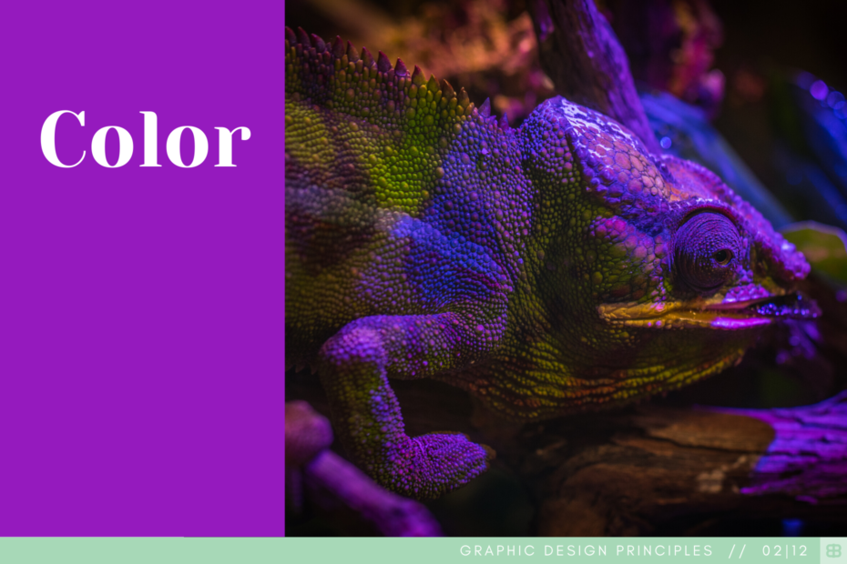
10 million different colors. That’s what the human eye can see. So, with no shortage of options, how does one make the right choice. First thing’s first: know who/what you’re designing for. Color gives a great ability to add intention and purpose. This idea of intention can go to another level when you consider variables like culture, age and other demographic info. Color in the right situation has a clear meaning (red=stop, green=go). In other situations, these colors could have a completely different meaning, provide different emotions, be super appropriate…or the opposite.
Color theory, culture, meaning…it’s all important to understand, but don’t forget the simple power of stepping back and deciding if something just looks good. Do it with intention and the best interest of who you’re designing for in mind, and you’ll have chosen wisely.
Sometimes, making the right choice with color goes back to basic color theory. It might be basic in it’s foundation, but it’s anything but in it’s terminology (primary, secondary, tertiary, hue, shade, tint, tone, temperature, harmony, complementary, analogous…it doesn’t stop!). Other times, making the right choice is understanding what/how someone has learned about color through their culture, education and experience.
Color theory, culture, meaning…it’s all important to understand, but don’t forget the simple power of stepping back and deciding if the colors you chose just make something looks good. Do it with intention and the best interest of who you’re designing for in mind, and you’ll have chosen wisely.
