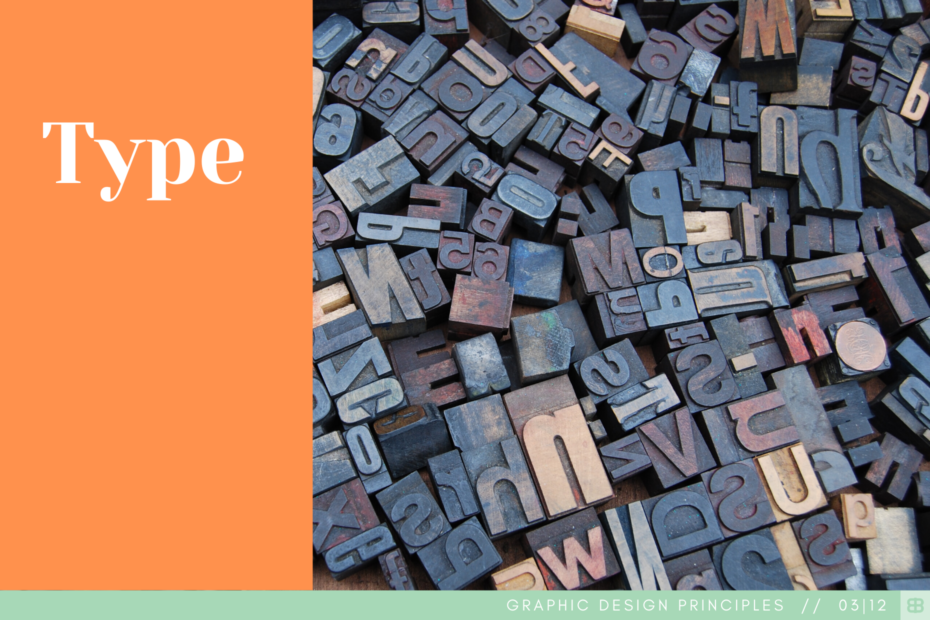
Circles, lines, angles and curves. Going deep into the history of type, the basic shapes that make up the typefaces we use to communicate come down to a similar fundamental structure of a combination of simple elements (see Points, Line & Shape). And like many of the pieces of a design, these simple elements build up to make something more complex; type, text, words…call it what you’d like.
I will not claim to be an expert on typography. I, like many designers have my favorites and have to force myself to intentionally choose different typefaces and even more importantly, the right typeface for the project, client, etc. While I won’t claim to be an expert on typography, I will always claim to understand it’s importance. Type can be used to put the power of statement into a design or it can simply be the design. Type can also be the only aspect of a design. Do you know any good logos that are just good type, formatted the right way? Google, Facebook, Sony, etc.
While I won’t claim to be an expert on typography, I will always claim to understand it’s importance.
There’s a lot to consider. Weight, serif, sans serif, slab serif, script, monospace, decorative – and then on top of it sometimes you need to pick two of them to make something interesting! It can be a challenge but it’s so necessary and so important to be done the right way. To that point, if I can give any advice it’d be to stick to the classics, the basics, the ones you know and love. There will be plenty of opportunity to be bold and decorative – as long as it makes sense for the project (here’s a great example of what not to do (papyrus).
